This one really makes me cringe. Everything from the glaringly obvious terrible sales pitch to the image are just wrong. One, a rose? really? There couldn't have been a less appropriate flower to use, and it's thriving and bold, so unlike the dire and desperate landscape of the novel. Poor show. (Also, a love that never dies? It did die, along with Heathcliff.)
Oh yes show a vain girl putting on her make up! Because this book was really all about how polished and pretty Plath was.
"The most romantic story ever written"....between a prostitute and a gay man.
If Mill's and Boon did the 1920's.
Some re-designs really do pull it off though...
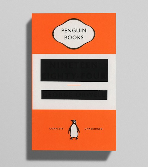
This is probably my favourite re-design ever, well done Penguin! (it's 1984 if you can't see it!)


Ugh, those covers are just awful -- they just seem really cheap and do not do those books justice.
ReplyDeleteSo cheap!
DeleteI've seen the re-brand of Wuthering Heights before, and it's such a hideous, cynical piece of marketing. The redesign of The Bell Jar is just baffling...
ReplyDeleteI suppose it may have gotten 15 year olds to read it but still...
DeleteI think The Bell Jar is the worst one, it reflects nothing of the story!
What is up with that Virginia Woolf? Oh my ... that really is one terrible cover re-design.
ReplyDeleteRight?!
Delete